Ionic components are made of high-level building blocks, which is known as components. These components allow us to construct the interface of the app quickly. The Ionic Framework contains many built-in components, which are buttons, modals, popups, lists, cards, etc. Here, we are going to learn about how the component looks like and how to use them.
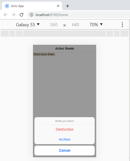
An Action Sheet is a dialog which allows us to choose to confirm or cancel an action from a set of options. It always appears top of any other components on the page and must be dismissed manually by the user to interact with the app. When the Action Sheets are triggered, the rest of the page darkens to give more focus to the options of the Action Sheets.
Sometimes, we use the Action Sheets as an alternative to the menus. However, it should not be used for navigation.
We can understand the working of Action Sheet Components through the below example.
home.page.ts
It is the main page of the Ionic app, which is responsible for the user interface. Here, we are creating a menu, which contains destructive, archive, and cancel element.
home.page.html
This HTML page is responsible for designing (look and feel) of your home page. It also contains the actions on HTML elements like button element.
home.page.scss
It is the CSS file which contains the additional styles on the HTML elements.
Output
Now, execute the application on your terminal through the command given below.
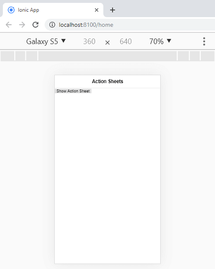
It gives the output as like below screen. Now, if you use an IDE, and modify or changes anything in the code, then after modification, as soon as you save the file, the browser automatically reloads your app.

Now, click on the Show Action Sheet button, the below output appears on your screen. When the Action Sheets are triggered, the rest of the page darkens to give more focus to the options of the Action Sheets.

0 التعليقات:
إرسال تعليق